Monday, 30 April 2012

Sunday Stameprs week 203 "RED" !

Over on Hel's Blog The theme this week for the Sunday Challenge is " Red" !!

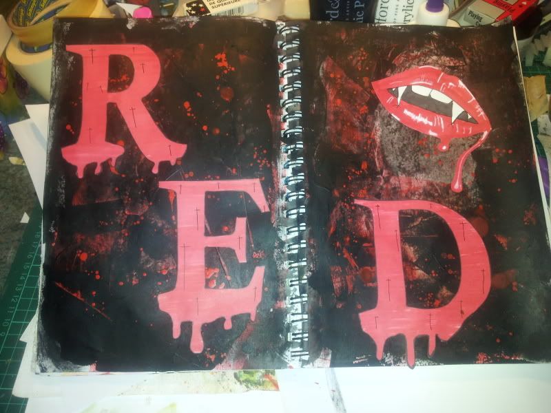
Now you'd NEVER guess I was watching a horror movie last night would you lol!... Yep! I'm one of those blood thirsty people who just loves to curl up with a fantastically gory horror movie....love anything to do with Vampires, Werewolves, Zombies or just general loss of lots of limbs and blood!! lol...So I couldn't resist doing this journal spread! It was the first thing that popped into my mind when I read what the theme was!

Anyway.... I was all 'girlied' out after finishing off that Tim Holtz Print Tray so just felt like a wee change!

firstly I gessso'd the pages with an old bank card, dried it off, spread red acrylic with an old bank card, dried it off, then spread black acrylic with an old bank card and dried that off! When it was dry I made up some runny red paint and flicked it onto the pages to give a decent 'bloodsplatter'! cool huh?!! lol .

Put it aside to dry while I worked on the  letters, which are in fact plastic templates, I drew round them but added drips of 'blood' along the bottom of the letters. Coloured them with red promarker , cut them out and then stuck them down and added some little black crosses.

The Vampire lips are drawn by me, (badly) but I used Google for decent EASY images to try and copy! (I'm terrible at drawing) lol!

All in all a suitably gory and atmospheric double page spread! And trust me, those reds are MUCH more vibrant than in the photo, the flash form my camera has washed it out slightly!

I REALLY enjoyed this spread! It's just so... well ... ME !!


Take care and thanks for dropping by

Jackie x

Saturday, 28 April 2012

Tim Holtz Print Tray !

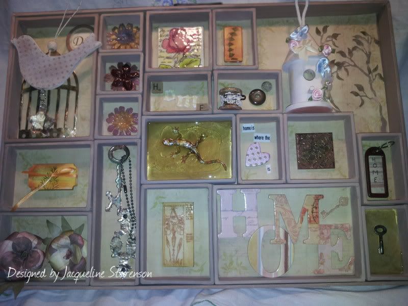
Here's what my desk was tidied up for!! lol...... My print tray in all it's glory!! :D

Something slightly different with the fact that it's all girlie and flowery! Absolutely ADORE that little birdhouse though!! Must get me more of those! :D

The wooden bird was just painted in a darkish brown then overstamped with a background stamp and embossed with clear embossing powder! Then painted over with white which was then wiped off, shows up the dots really well! The birdhouse was just painted and some little silk ribbon bows and flowers added. The lizard in the middle is a little toy rubber one which was gilded and then melted UTEE poured over from the meltpot! Did the same technique with that tiny little key in the botttom right corner! There's an old key fob, some chipboard letters, buttons, hearts, and some die cuts. The three paper flowers were versamarked then embossed with clear embossing powder to make them look like porcelain!

The two  big roses at the bottom left were made using a rubber stamp. The Square gold tile is a chipboard square which was triple embossed in gold and them stamped into while it was still hot, got great texture with that one!! The coloured rose at the top is done on stampboard, coloured with Inktense pencils then triple embossed with clear powder, the same technique was used with the rectangular tile at the bottom! The little tile at the top with the green diamonds is actually a domino! Coloured with alcohol inks and them stamped onto!

The little book on the left is a 'ticket strip' which was stained using distress stains, then stamped onto the inside , concortina'd and held closed with a matching ribbon!

Think I've covered all the bases on bits and pieces...  I had a blast with this project as it is a lot 'softer' than the last one I did!

I learned all the techniques from Jennie at The Artistic Stamper , she ran a workshop last year which I attended and I LOVED every minute of it!! Jennie and Co. were wonderful and I learned soooooo much that day! Want to do another one but sadly funding won't allow at the moment!

anyway, It's late and I'm off to bed....

Take care and thanks for dropping by,

Jackie x

Wednesday, 25 April 2012

WOYWW ! 151 !

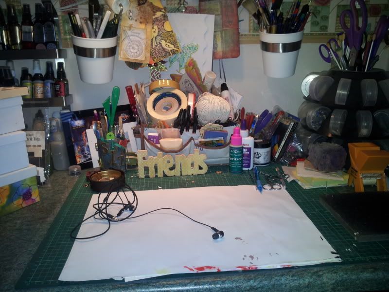
Yeeees ... You ARE seeing correctly! I tidied!!!!! lol.... Needed the space to work on a Tim Holtz Configurations Print tray!! So basically all you see is a rather ugly set of headphones for my phone so I caqn listen to music while 'working' !

Before I go any further though, I would just like to welcome some new followers to my and say Thank you for taking the time out to read some of my inane ramblings lol! I really do appreciate it, as I do for all the lovely comments you wonderful people of blog land so kindly leave :D


Right. Now on for the reason of this post, if you would like to see what other people have been up to on thier work spaces then please pop over to  Julia'sStamping Ground   and have a good nosey!!


Take care everyone, I'm off out with my mum today :)

Happy WOYWW !

Jackie x

Monday, 23 April 2012

YES !!!!

Just a quick update on the college saga!

AT LAST I've heard back from them and I've been accepted for a place on an NC Art and Design course! :D

To say i'm pleased as punch is an understatement!! I'm thrilled to bits! Didn't have the academicals required so totally relied on my portfolio!

whew! Glad the wait is over for now....it's just a case of waiting to see how things go for my teenager! He is waiting to hear if he's been successful too ..... *sighs*


Take care

Jackie x ... STILL smiling lol!

Sunday, 22 April 2012

Sunday Stampers week 202 summer colours!

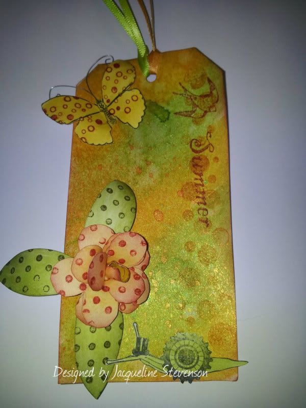
I chose to do another tag this week for my entry into Hel's Sunday Stampers Challenge. The theme this week is " Summer colours ".

 I coloured the background randomly applying using Wild Honey and Peeled Paint Distressed stains then overspraying with some water. After drying I then sprayed Daffodil and Mint Green Glimmer mists, and a little of Golden Fish cosmic shimmer! I used Borders #2  for the big dots down the side using Fired Brick Distress ink. I set the tag aside to dry and started working on the flower! This was done using the Flower Power themeplate from The Artistic Stamper, it was coloured using Wild Honey and Dried Marigold Distress inks, and then over stamped with Dots background stamp using Fired Brick, the leaves were done the same way only using Forest Moss.


The Butterfly and Snail are from Tick Tock Butterflies oddly enough lol  I overstamped the butterfly using The borders # 2 in fired brick again and just added some wire for the antenae!

The wording is from a set from my stash

I really like the nice bright colours of this piece! Made me smile while doing it :) I hope it makes you do the same!

Take care everyone and thanks for dropping by.

Have a great Sunday!

Jackie x


Friday, 20 April 2012

Flower Canvas


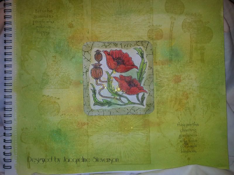
I was having a little play today with the canvas pad I bought a few weeks ago, I haven't used this stuff before as I've only worked on the stretched deep frame canvases!

I was pleasantly surprised the way this piece turned out, wasn't really sure what it would be like being my first try on this stuff!

Believe me when I tell you though that the centre image blends in a LOT better than in that photo! It was taken using my mobile phone! Anyway... The main image is from the Flora and Fauna themeplate from Chocolate Baroque. It was stamped onto white card which was sprayed with mint green and yellow Glimmer Mists. I coloured it using Inktense Pencils (my favourite). I distressed the edges of the image to soften it slightly, just matted and layered it onto some card which was distressed and then overstamped!

The background of the canvas was quite simply done actually....I sprayed the whole sheet with water then gave it a was with a Ranger paint dabber in Lettuce, dried it off with a heat gun then dotted around some Wild Honey Distress stain, which was immediatley sprayed with water then wiped away using a baby wipe! Dried that off then over sprayed the whole thing mint green and yellow Glimmer mists.

I then over stamped with some various floral stamps from my stash! (Don't you just love those poppy heads) . I just added the little phrase from the same themeplate as mentioned earlier to just balance everything out a little!

REALLY pleased with this piece and I love the colours! I am not usually a fan of green but think but it's quite a yellowy green it has 'warmed' it up a little!


Thanks for dropping by

Take care and have a great weekend!

Jackie x

Thursday, 19 April 2012

Altered book lesson 6 pt II


I'm taking part in an online course run by Elizabeth! I must say it has been extremely interesting and quite challenging at times but I'm enjoying myself experimenting!


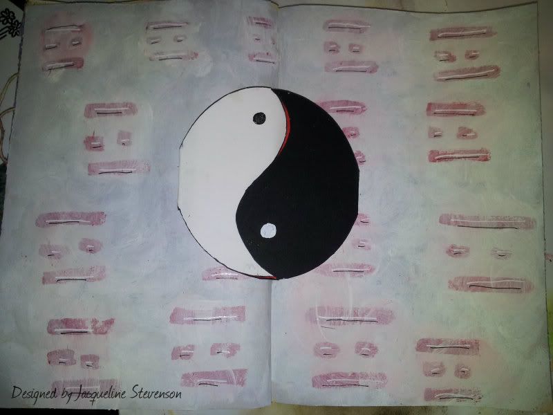
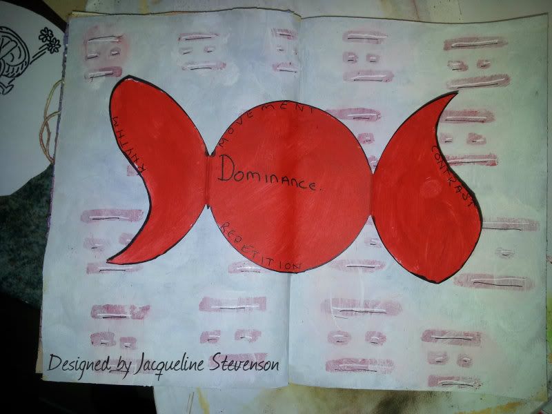
This spread is for lesson 6 Design prinicipals part 2 - rhythm, movement, contrast, repetition and dominance!

I think I've covered everything with this spread. Not a lot of materials used other than acrylic paints, some spare card, a black fineliner and a white paint pen! Oh yeah...and a roll of tape to draw round for the circle!

Here's a view of the inside of the Yin Yang symbol....


If you would like a btter look then just click on the photos to enlarge....

Here's how it was done....

Gesso base, then again badly mixed some black and white acrylic paint, just swirled it over the pages, then added the red Feng Shui symbols, when they were dry I gave the whole thing a thinned out coat of white paint!

I drew round a roll of sticky tape for the big Yin Yang symbol in the middle three times overlapping each circle, so that when I cut it out they were joined, I folded the layers over each other and then cut through the top two layers so that the lines in the middle would meet exactly! I just painted the inside in red then wrote the words in black fineliner!

Stuck it down (squint) * sighs* with some ordinary white craft glue!

Really like the strength of the Dominance and contrast of this piece! Quite pleased it came out VERY similar to the idea I had in my head!

I hope Elizabeth likes it and I've done what was asked!


Thanks for dropping by,

Jackie x