Wednesday, 6 March 2013

Love ! Steampunk Style !

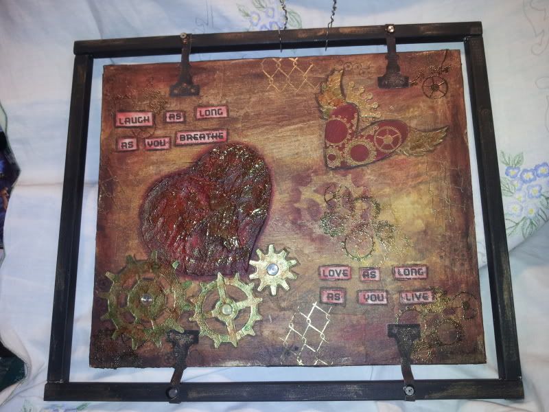
well, I  managed to squeeze in some more "me" time and did a little crafting for myself. I've had this idea in my head for a while and decided it was time to try and see what I could do with it.

I started off with a canvas board that I had done something else and wasn't happy with so I decided to recycle it. I pasted some torn up newspaper over the base with wallpaper paste. When it was dry I gave the whole thing a coat of Gesso, left it aside overnight to dry then painted over it randomly with acrylic paint , rubbing away some paint with  kitchen roll to let some of the newsprint show through. I also used some die-cut cogs as stencils and dry brushed around them randomly over the background.

The big heart is textured and done using Pollyfilla mixed with PVA glue instead of water. I drew a big heart shape on a piece of card then cut it out, stuck the "stencil" down with some pritt stick and them spread over the home made texture paste. Lifted off the stencil and then it dry overnight.  I then gessod' over the heart and when dry I painted it rubbing some paint off to try and give it some 'shading'. when dry I embossed with Cosmic Shimmer gold embossing powder.

Here is a close up of the textured heart
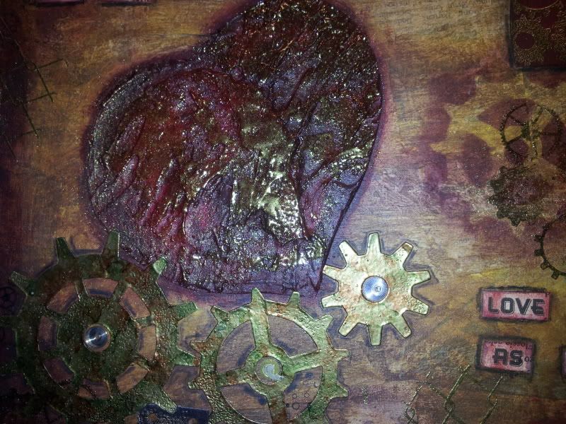


The cogs are the Alterations Gadget Gears die which have been embossed with gold embossing powder then gone over with some alcohols inks to give a bit of a rusty look. Did the same with the wings and crown from the Alterations Winged Heart die. The small heart is just painted red, and over stamped and embossed using the Small Cogs stamp from The Artistic Stamper background stamp. I used the same stamp randomly over the background but stamped twice, once with black Archival ink and again in clear versamark which was then embossed with cosmic shimmer gold embossing powder. I also used a chicken wire background stamp and embossed that in gold randomly as well as some small cogs.

The frame is an old slot together tapestry frame which was painted black/brown. I attatched the picture using a  door hinges  die cut from grunge paper and then painted black, I cut off the fancy end and then glued them to the frame, gave them extra support with a drawing pin painted over with black promarker. For hanging I just twisted some wire together. I added some watch parts to the centre of the cogs and also the drawing pins, then dry brushed over some copper colour acrylic paint just to age it a little. The quote is one from Johnny Depp and was printed off onto some old book pages and distressed with Fired Brick distress ink.

Really pleased with the way this has turned out, as I said earlier it was just an idea and I wasn't really sure what I was going to do to attatch it to the frame, but as I was working on it things just seem to fall into place.

Thanks for dropping by and taking the time out to read.

Take care everyone.

Jackie x


Saturday, 9 February 2013

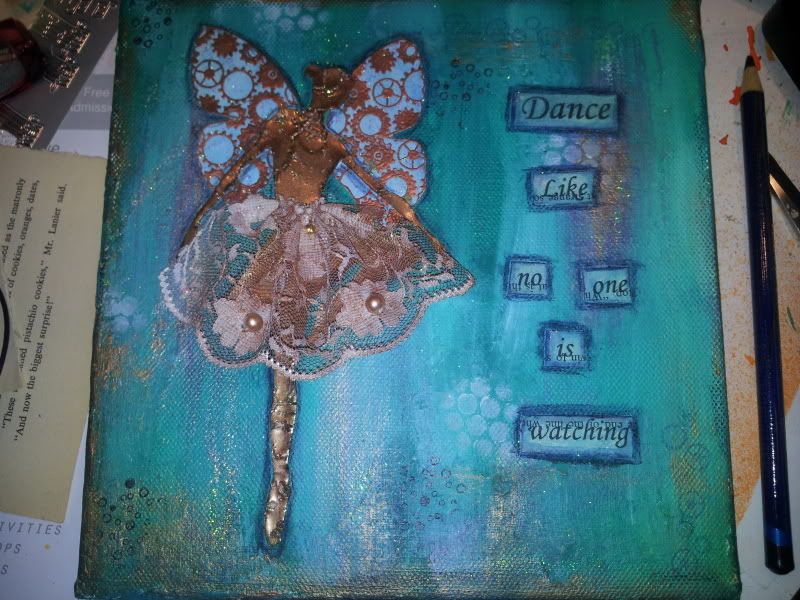
A little 6 x 6 mixed media canvas.

Been having another play with some mixed media stuff today and I am really pleased with the end result for a change!

Started out with an old 6 x 6 canvas that I had done previously and didn't like it , so I  'canibalised' it! Managed to leave some seriously stuck paper to it which was a bonus because it actually gave me a little texture.

Anyway, I gave the whole a going over with some Gesso, when dry, I randomly painted on some acrylic paint, added another colour, some white and a little copper metallic paint.

The 'fairy' is the same as the previous one done in the journal page, a clip art image which was shrunk down. I used versamark clear ink and then heat embossed her in copper, added another coat then stamped into it while still hot with  my favourite crackle background stamp.

Her wings are done using the Tick Tock Butterfly stamp from The Artistic Stamper and stamped using versamark clear and copper embossing powder. Her skirt is a piece of cream beaded lace I had in my stash so I just lightly painted it with copper metallic paint and then when dry I gathered it up  with a few stitches and then stuck it down with a hot glue gun

Printed the phrase off onto some old book pages and coloured them using Denim Distress ink.  Randomly stamped a cogs border and spot border and also used a little sequin waste with some white acrylic paint.  Edged everything off with an Indigo Blue Inktense pencil and then rubbed over some Crystal Stickles!

Really pleased with this piece and I am thinking about entering it into an exhibition being run by the college. Not very often I am confident about my work but this piece has changed that for the time being.

Thanks for reading,

Take care and enjoy the rest of your weekend.

Jackie x

Thursday, 7 February 2013

An explosion of colour!


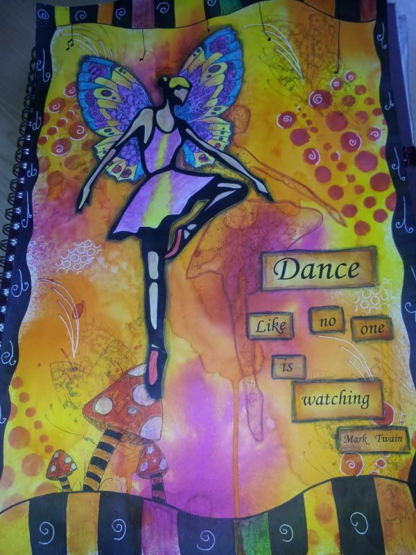
Well, I've had a little "me" break yesterday/today....needed to take some time out from college art and do some of my own. So, I spent some time working on a journal page.

I sprayed the background with Dylusions Lemon Zest, Squeezed Orange and Bubblegum pink onto lots of water to let them all blend in together.. when dry, I randomly stamped over it using Fired Brick Distress inks and Black Archival ink.

The "fairy's wings" are actually stamped using the Patchwork Butterfly Themeplate from Chocolate Baroque as are the random stamps of swirls and a half butterfly in the background.

I coloured the wings using Inktense pencils....LOVE these pencils!! ..... now on to the ballerina....this was a clip art  image from Microsoft word which i just enlarged....i printed it off twice. Carefully cut out the ballerina from one image and used what was left as a stencil. I drew around it with an inktense pencil and then overstamped the 'space' with my favourite crackle background stamp using Fired Brick Distress Ink. I was originally going to colour the ballerina all black and use her as a silhouette but changed mind and decided to colour her instead, again using Inktense pencils.

Wasn't very happy with the background so I added some stencils and doodles to 'finish' it off a little.

Once everything was stuck down I then edged it with a black intense pencil to make it stand out a little.

A bit of a change from me this time as I don't normally 'do' bright and girlie but I am surprised at the way it's turned out despite the fact I hate orange! I find it such a 'difficult' colour...always have and always will lol.


Thanks for dropping by,

Take care

Jackie x

Sunday, 16 December 2012

Mixed Media Art Journal / Sketchbook pages!


First of all I wish to apologise for being such a bad blogger! I have just been caught up in lots of 'life's stuff' at the moment and haven't really had a lot of spare time on my hands.

Anyway, we have moved onto a new 'block' of lessons in Art and this time it's Mixed Media!! Yay!! ....I get to play!!! lol.

We had the choice of four themes, but I picked 'The/my environment, simply because it was carrying on from the last block and I didn't need to kind of freak my poor brain out trying to concentrate on something else!! Lazy I know , but, hey, my poor wee brain has enough to think about just now! !

Enough rambling for now.....as I said earlier, I have chosen The / My Environment and of all things i chose to do it just HAD to be the Oil Refinery at Grangemouth!! .... Jeez... NOT very creative I hear you say...buuuuut... there IS a method in my madness because I am also working on stuff that is made with oil or derivatives of oil. So you see, it all ties together, AND it will tie in with something I have planned for further into this lesson!

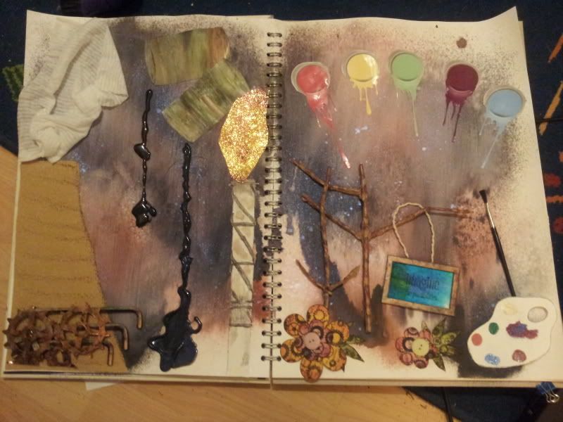
So lets get down to business then shall we?..... First off all these to pages are supposed to represent the positives and negatives of the Refinery, and it's seems to have turned out ok. Had an absolute blast (sorry) putting it together but boy was the prep work a nightmare....took forever!!

BACKGROUND

Is done by roughly painting a base of gesso on both pages, when dry I then sprayed lots of water and  used Dylusions Black Marble and Melted Chocolate spray inks, sprayed more water then just let the colours run into one another while drying off with a heat gun! Was looking for an "oil slick" look! I sprayed some Fireworks Interference Blue over the top of all that, wanted to get and "oil on water look"! Really pleased with the background, turned out exactly as I imagined (for a change)!


LEFT HAND PAGE


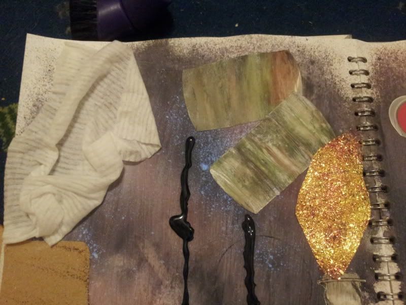
The large cooling tower is done using sandpaper! along with a dried out baby wipe for the steam!
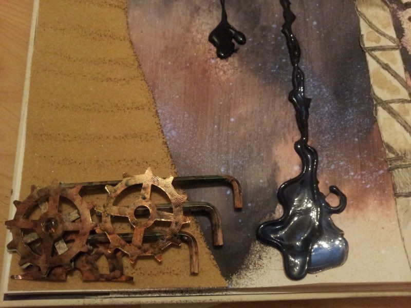
The "pipes" at the bottom are actually Allen Keys that were freebies form flat pack furniture from Ikea and are coloured using alcohol inks to give a kind of rusty look.
The cogs are die-cuts from mirri card and coloured using alcohol inks!

The oil drums were done by dragging dollops of white, green, brown and black acrylic paint along the page with an old bank card again to achieve a rusty look. when dried I just sketched the drums using some fine liners!

The "oil " is done with melted UTEE, Black and Interference Blue melted together in the meltpot and then dribbled onto the page. I wanted it to look like the oil was being poured from the drums!

The Flaring tower is sketched with fine liners and then water coloured. I used some yellow and peach/pink fusible fibres for the flame.


Here are a couple of close ups of the details.... the "pipes" and also the "oil"


And here are the oil drums....


RIGHT HAND PAGE

The trees are done with twigs from my garden and covered with parcel tape! Not the self adhesive shiny stuff but the horrible licky sticky stuff! I used a wet sponge! Wasn't going to lick THAT! YUK! lol They were coloured using alcohol inks!

The painting is a little chipboard frame again coloured using alcohol inks, and the painting is actually done on a "mop up" piece of kitchen roll from an earlier project, I just used a stamp from my stash to give it  a little interest and 'hung' it from the tree using a piece of string.

The flowers were done on coloured book pages using a stamp from my stash with buttons for centres.

The paint palette is sketched and i used a versamark pen and some embossing powders from my stash for the paint, added a wee cheapo paint brush to finish it off!

The "rainbow" paint pots are courtesy of a colour swatch brochure from B&Q!!

Quite a "Dark" piece but to be honest, despite the fact that I live not too far from the refinery it DOES have its advantages....I mean I would never have been able to study art at college if I couldn't use paint because there wasn't any oil to make it with!! lol!! I KNEW I would tie those two together SOMEHOW!!! lol..

So there you have it, this is what has kept me busy over the weekend! I sincerely hope it was what my lecturer was looking for!!

Take care everyone and thanks for dropping by!

Jackie x

Friday, 16 November 2012

Art Postcards.

In 'Contextual Studies' for Art we are working on 'timelines and movements'!

The brief was to do six art postcards on each movement of our choice but putting our own take on things! I have completed five and will work on the final one tomorrow, (getting really sore from sitting too long just now)

Anyway here's what I've completed so far

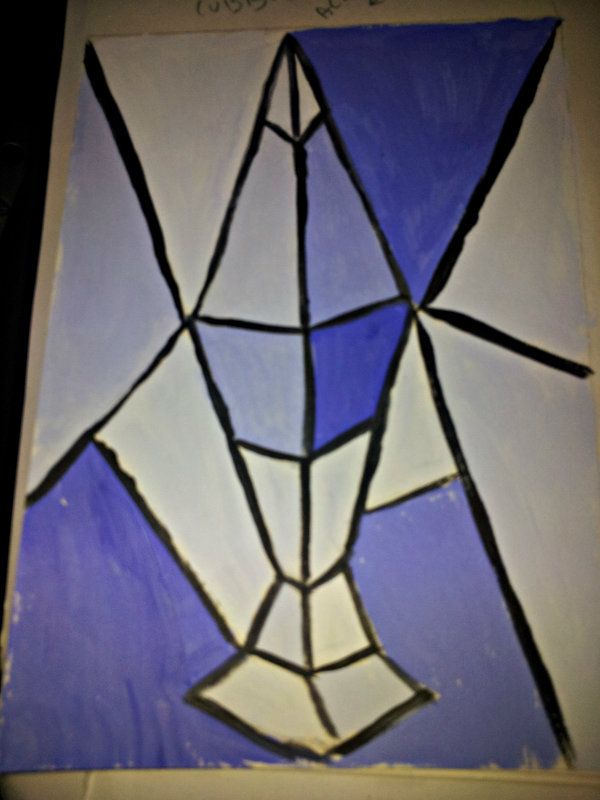
CUBISM _ 1907 - 1919

And it's a 'painting' of my lava lamp!! And it's loosely based on Pablo Picasso ... (I think) lol


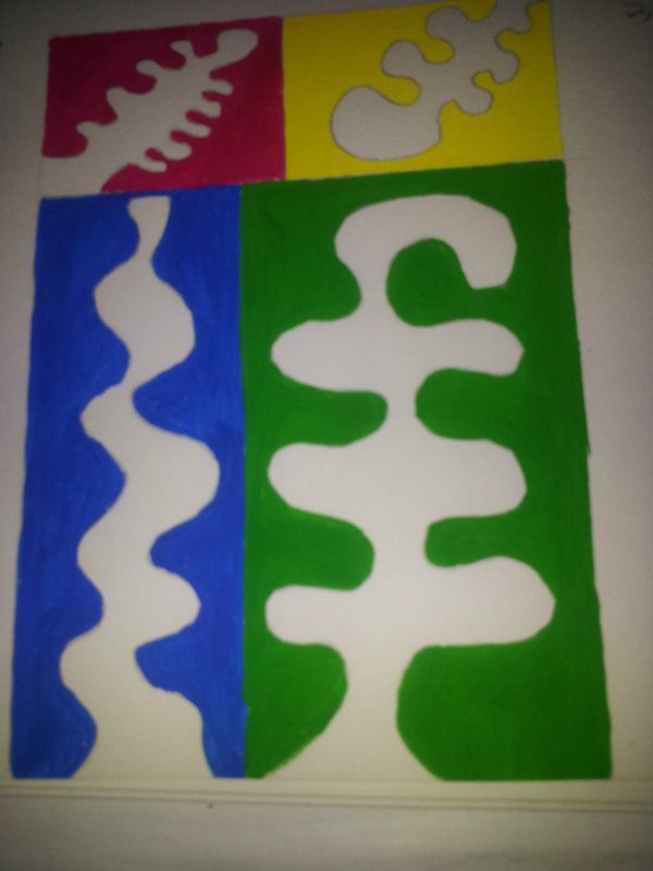
FAUVISM - 1904 - 1908

And this one is done in the Style of Henri Matisse


GERMAN EXPRESSIONISM 1910 's - 1920's

TO BE COMPLETED.....


Surrealism - 1920 -1930

This is just one of my own pieces. I just had a little play with some Dylusions, and some of my favourite rubber stamps along with a label printer and came up with this....Not sure how "surreal" it appears to everybody else but boy do I love those colours!!! The phrase is actually the lyrics from the Enigma song Prism of Life in case you were wondering.


POP ART

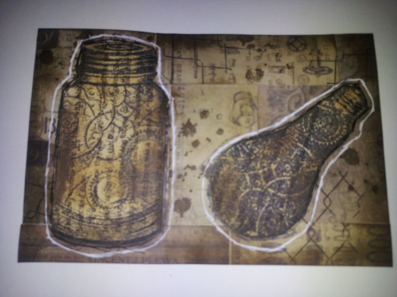
Now I could have went the easy road and did something to do with Andy Warhol....but I didn't.... I had a little look at Robert Rauschenberg's work and I love it!! So this piece is very loosely based on his work....despite the fact that Tim Holtz and The Artistic Stamper are in there as well....So I just collaged some of Tim's papers and used some of the Artistic Stamper's steam punk stamps!

MINIMALISM


A VERY simple piece ! I just drew round the circles in the  Dylusions "Chequered Dots" stencil and coloured them using a black fine liner! Simple but effective and it's again loosely based on Frank Stella's work.


So there you have it.... been a busy few days and I still have some more stuff to catch up on but I'll manage. I will post the German Expressionism one when I have that completed. And, that I'm afraid will NOT be tonight! It's Friday and I NEED to relax a little! Hopefully!  Wouldn't mind a nice little Bacardi or two but alas, the big nasty painkillers I'm on will NOT allow! *sighs*

So take care everyone and thanks for dropping by.

Have a great weekend

Jackie x


Alternative self portrait .... pt II

Hello everyone, I finally managed to get the other pieces for my Alternative Self Portrait. This is a project for Analytical drawing in Art and Design at college.....if you look at the previous post you will see the other three pieces I've completed.

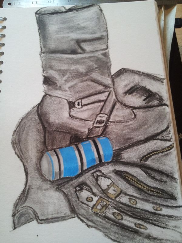
This piece is done in Charcoal and Gouache paint and is a piece about my favourite boots, jacket and perfume!

 
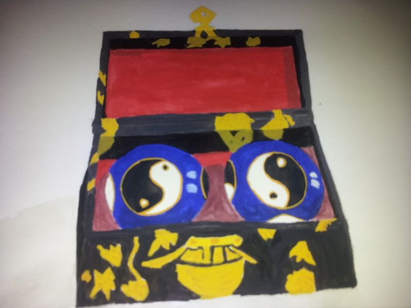
And the final piece is a painting in Gouche of my Chinese Therapy Balls and basically signifies my liking of the 'different'!.

I was really quite daunted to start this piece because there was so much detail in it but once I got going it wasn't as bad as I thought. I did cheat when it came to the balls though....I used a bottle of nail polish remover to draw around to get good circles! lol... REALLY pleased with the way it's turned out though!

I THINK I've achieved the aim but won't really know how well untill I get back to College and hopefully that will be on Monday! Still feeling very sore and miserable with this sciatica though, but I NEED to go back. I just can't take any more time off.

I have some more pieces ready to be 'blogged' for another project I'm working on in a different class so watch this space....


TTFN

Jackie x


Thursday, 8 November 2012

An Alternative self Portrait.

Well it's been a wee while since I last blogged anything and to be honest I just haven't had the time. Just been busy catching up and studying.

I haven't been to college for a week and I'm off again next week thank to 'unforseen circumstances'! OR if you prefer....a rather nasty recurrence of Sciatica, and, by way of trying NOT to hurt it even more when packing my bag for college last week I ended up pulling a muscle in my back! Ouch was NOT the word I used lol!! But it'll do for now....Soooo after a doctor's appointment, and some seriously strong painkillers I now find myself ever so slightly 'floating' all over the place!

Anyway.... enough of this rambling.... In our analytical drawing class we were issued with a brief to do five finely finished detailed pieces on one subject of our choice. I decided to go for an Alternative Self Portrait, thought it would be fun, and something a little bit different.

So below I've posted photos of the three pieces I've done so far..... Hoping to get the other two finished this weekend if I can sit still long enough!!

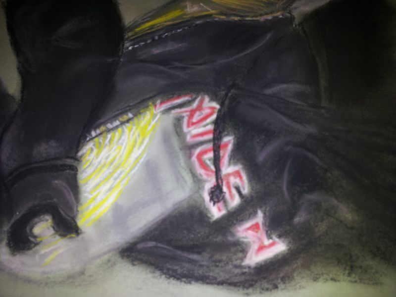
This first piece represents my favourite band! Yep! As if you all didn't guess already lol.... It's Iron Maiden !! So i decided to draw my 'hoodie' using pastels! I just part of it but I'm really pleased with the end result!


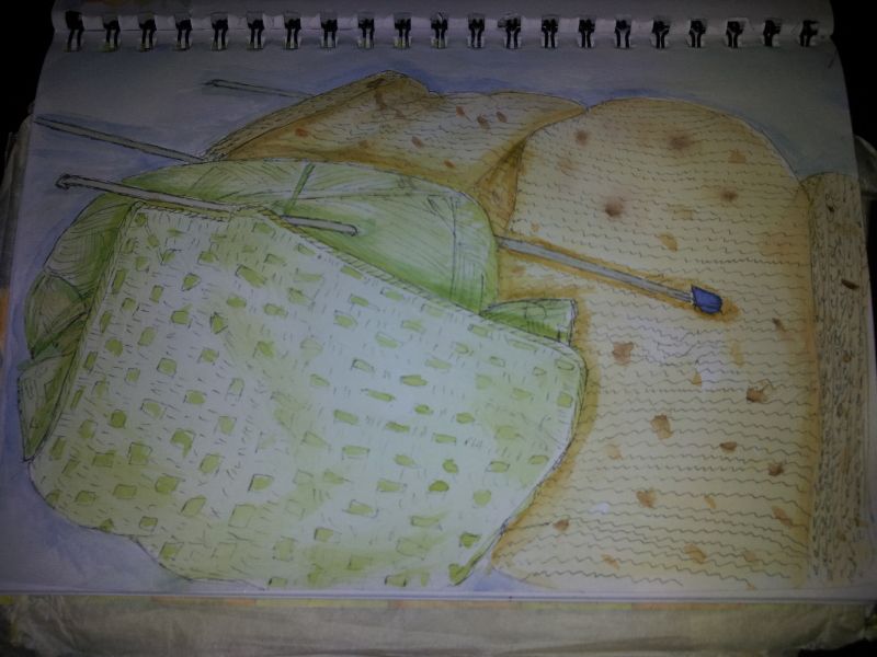
This one represents one of my hobbies.... knitting and crochet, done in watercolours and detailed with a fine liner uni pin pen.


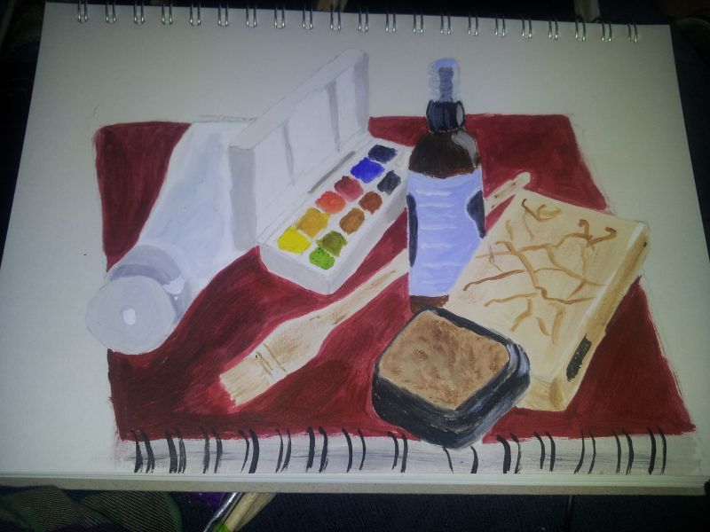
And last one for now is just something that represent me and what i like.... just some art/craft materials painted using acrylics! REALLY pleased with this as I've never painted a 'proper' complete picture before!


So there you have it.... sorry I can't stay for a bit longer but it hurts too much to sit for too long. So I'll say Cheerio for now,

Take care everyone and thanks for dropping by,

Jackie x