Well here's another spread from my altered book! Over on Elizabeth's Blog She is doing a wonderful course for one of these! This is my first attempt at one and I'm thoroughly enjoying it!
I am not quite sure I've achieved what Elizabeth asked for but this is all I have managed I'm afraid! Couldn't really concentrate due to 'domestic stuff' causing chaos...but I tried.!
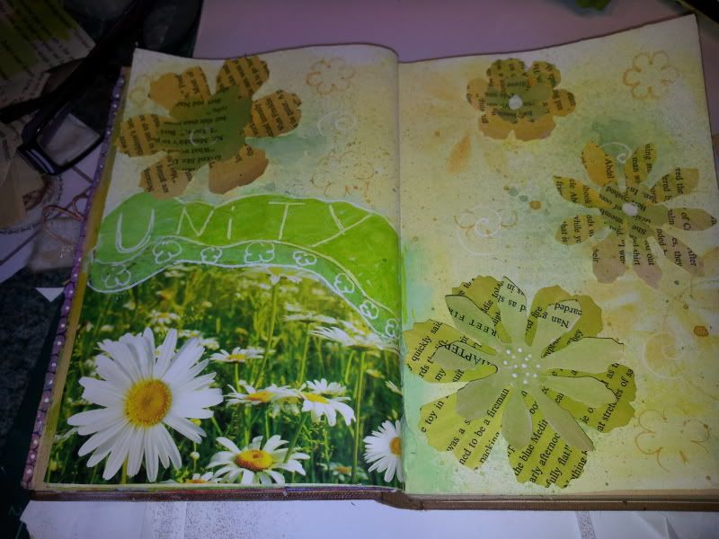
Here's how the pages were done....
Yellow and white(lots of it) acrylic paint for the base colour! very roughly mixed and just slabbered over the pages...some great texture there but sadly it's such a bad photo that you can't see it! Some randomly stamped flowers and some randomly stenciled flowers, which are in fact the remnants of the page where those big flowers were cut using the Alterations Tattered Flowers die! I also sprayed some Mint Green Glimmer mists over the page th tone in the green better! the flowers are coloured using various spray inks, pro markers and aqua markers!
The daisy photo was the front of a flier that came through door, advertising some fancy big shopping mall that I probably need to get two buses to get to... lol....some green and yellow paint over the top to blend it into the page...
Not really very happy with this because I'm not sure what I was trying to achieve....but that's the fun of these books...it's all about the learning! :D
Anyway, thanks for looking in
Take care
Jackie x
I am not quite sure I've achieved what Elizabeth asked for but this is all I have managed I'm afraid! Couldn't really concentrate due to 'domestic stuff' causing chaos...but I tried.!
Here's how the pages were done....
Yellow and white(lots of it) acrylic paint for the base colour! very roughly mixed and just slabbered over the pages...some great texture there but sadly it's such a bad photo that you can't see it! Some randomly stamped flowers and some randomly stenciled flowers, which are in fact the remnants of the page where those big flowers were cut using the Alterations Tattered Flowers die! I also sprayed some Mint Green Glimmer mists over the page th tone in the green better! the flowers are coloured using various spray inks, pro markers and aqua markers!
The daisy photo was the front of a flier that came through door, advertising some fancy big shopping mall that I probably need to get two buses to get to... lol....some green and yellow paint over the top to blend it into the page...
Not really very happy with this because I'm not sure what I was trying to achieve....but that's the fun of these books...it's all about the learning! :D
Anyway, thanks for looking in
Take care
Jackie x
11 comments:
I really think your page came out lovely! I certainly see Harmony, Unity, Emphasis and Balance! I need to work more on interesting backgrounds.
I am loving thi book, must do some more to mine soon.
Great chce of colours.
I love your page and think you did a wonderful job! Me thinks you know more than you're letting on! ;) waving hi from the hills of North Carolina :)
I think your page is very pretty and colourfull and well balanced etc etc
janet
I definitely saw unity in this piece. Unity is a very hard concept to understand, so the closer the items are together, the better the unity. Of course, I also saw emphasis in this one, too.
Your use of the flyer made me smile, since I'm all about recycling what we have and not buying anything extra for this course. It was great for this spread, too. Hope your week goes better and you can make a bit of art. I'm really enjoying the way you break your homework up.
I think it is lovely and I only did one page for lesson 5 and the same for lesson 6 so I wouldn't worry. BJ
I think your pages work very well. Firstly, they appear to belong to each other. Secondly, the eye is led in from the left page onto the right so the design must be working properly.Thirdly, the colours harmonise beautifully. Lastly, I LOVE tattered florals so you'd get my vote every time!
Juliaxx
Thanks Jackie, have to say your page inspired me - BJ
I love the layered flowers and bright springy colors of these pages. I definitely see the harmony (colors) and unity (flowers), emphasis (largest flower) and balance (asymmetrical). Overall, I think the main purpose is to make a page you like! You should like this one, it's so pretty. Visiting from Elizabeth's.
Yellow is my favourite colour so your background makes me happy and I wish I could see the texture better. And what's not to like about daisies! I luv the use of the extra paper as flowers. Great job.
I love the bright colours, so sunny and cheerful. Your book is coming along wonderfully well.
Post a Comment